Creating A Bright Brand
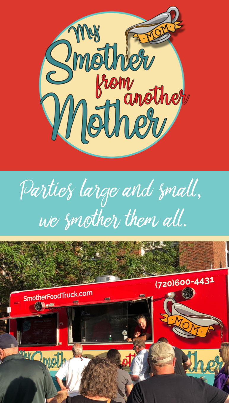
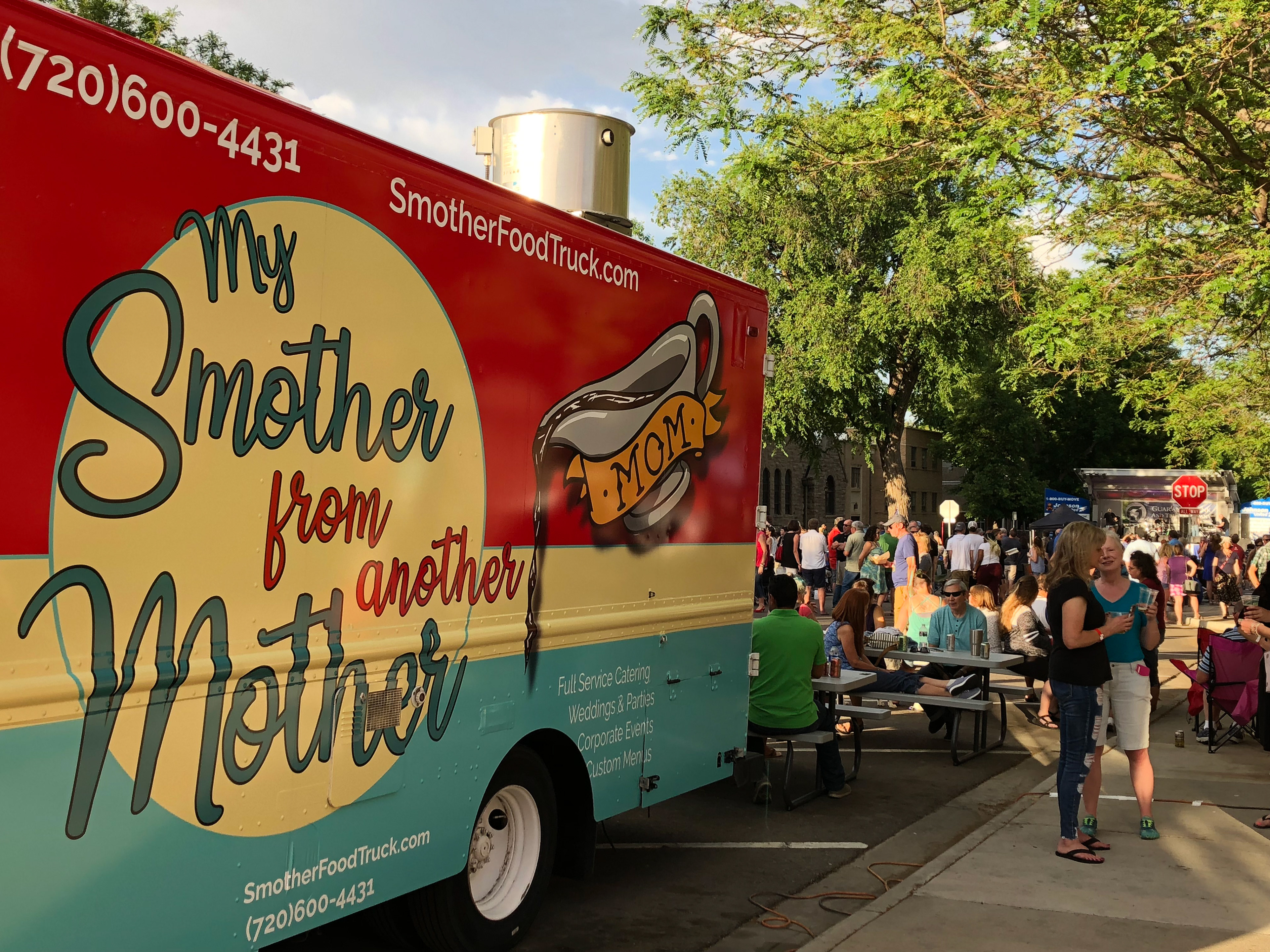
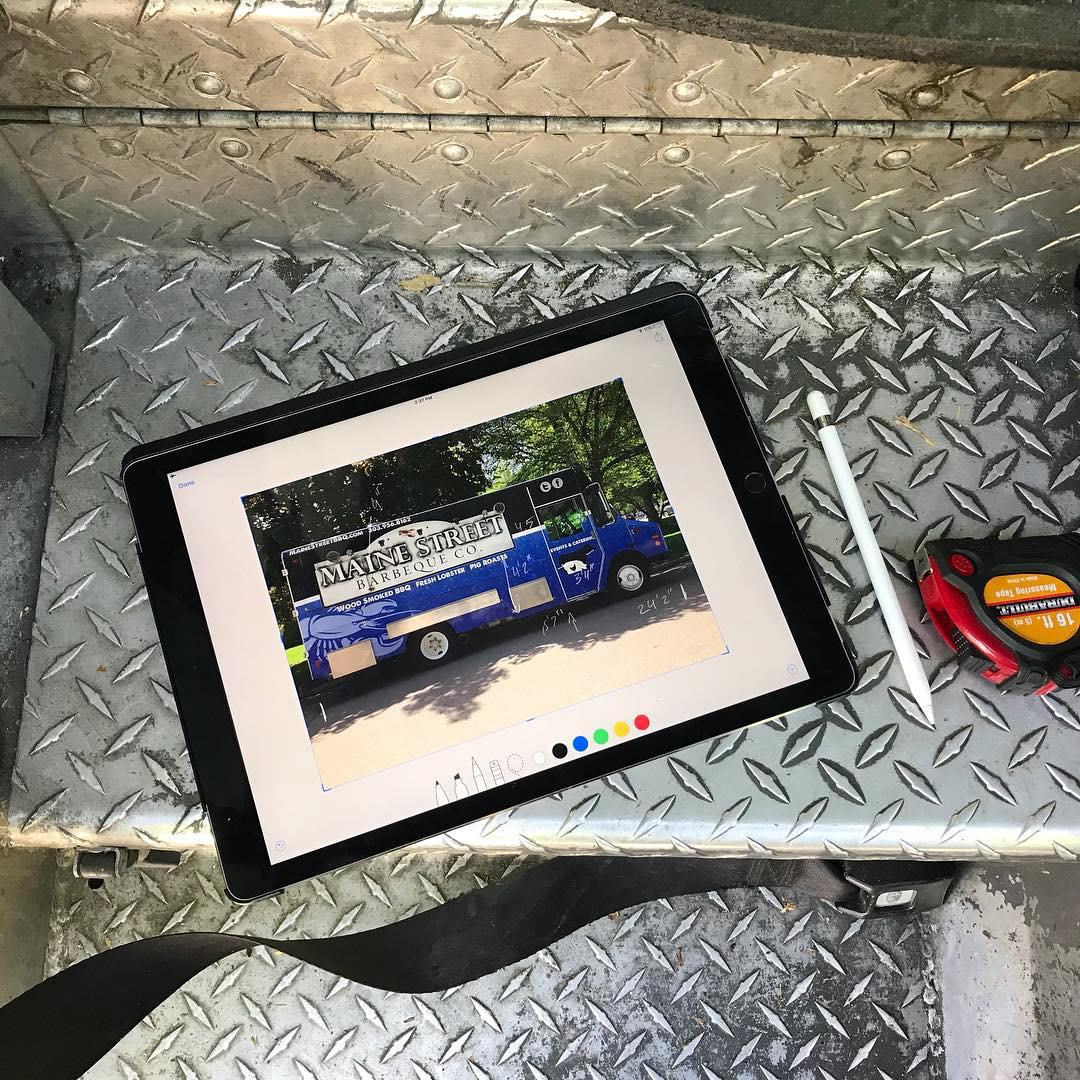
Although often we are thought as an agency for creating engaging commercials, social media content, and ads, we have deep experience in branding and graphic design. When approached to build a brand image for a new food truck that specialized in smothered we collaborated with the owners to find the perfect identity. One of the owners wanted something that had a gravy boat theme. We took that and made some sketches for the gravy boat and added the classic Mom tattoo. Although the food truck had a long name we decided it would be a great visual anchor with hand written text. Since the truck has to stand out and be visible to attract customers we chose a modern bright color palette. We used an Apple iPad to take pictures of the food truck and create reference images that we then sketched over. We built the design using Adobe Draw on the iPad. This gave us the ability to present to the client multiple versions of every part of the design.
A 30 Foot Graphic
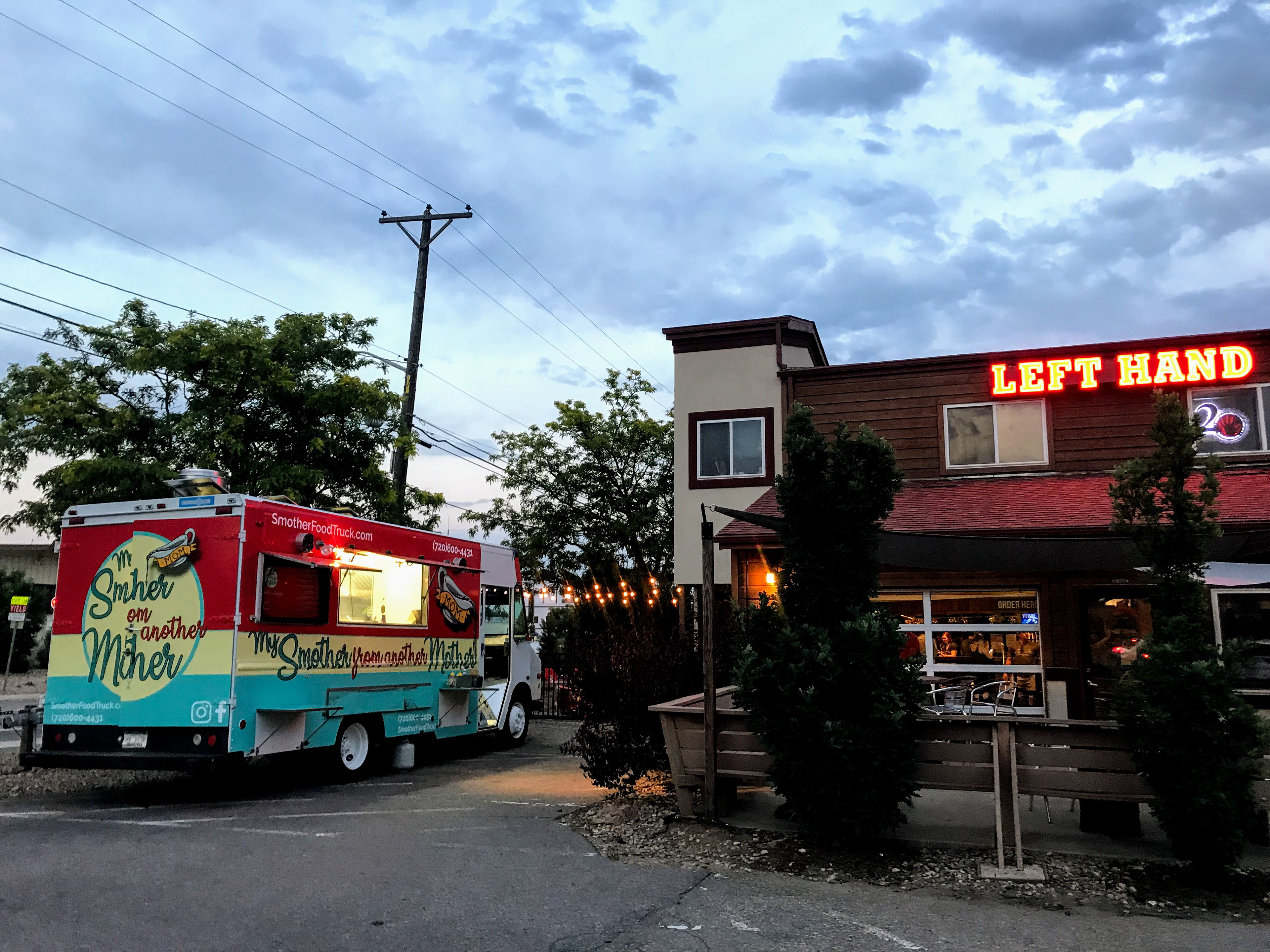
Designing the branding was just the beginning of the process. Once the design was finalized we moved forward to actually fitting the design to the truck. We took careful measurement of the truck and the various panels and access points. We scaled the design in illustrator to meet the needs of the printer and installer. Circle Graphics in Longmont provided an outstanding print that was installed in Denver. With the truck wrapped we worked on the details including a mobile slide show menu, the printed menus, and the employee uniforms. The truck had a warm welcome over the summer and now is seen busily serving around Boulder County.
Original Food Truck with drawn measurement notes.
Rough Logo Sketch
Rough Mockup
Refined Mockup


